In the photography industry, the vast majority of photographers use Lightroom to process their photos. It is incredible software, specifically built to allow an efficient and fast workflow when editing photos.
But beyond the basic global adjustment sliders such as exposure, contrast and saturation, there are some amazing and underutilized tools that allow you to have much more control over selected parts and colors of your image.
And today, I want to talk about one of my favorite tools to enhance my photos: The HSL Panel.
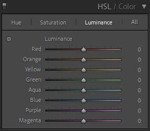
HSL stands for Hue, Saturation and Luminance. Simply put, this panel allows you to individually control each color, instead of global adjustments that would affect the entire image.
Let me show you a few examples of what can be achieved:
Hue Panel:
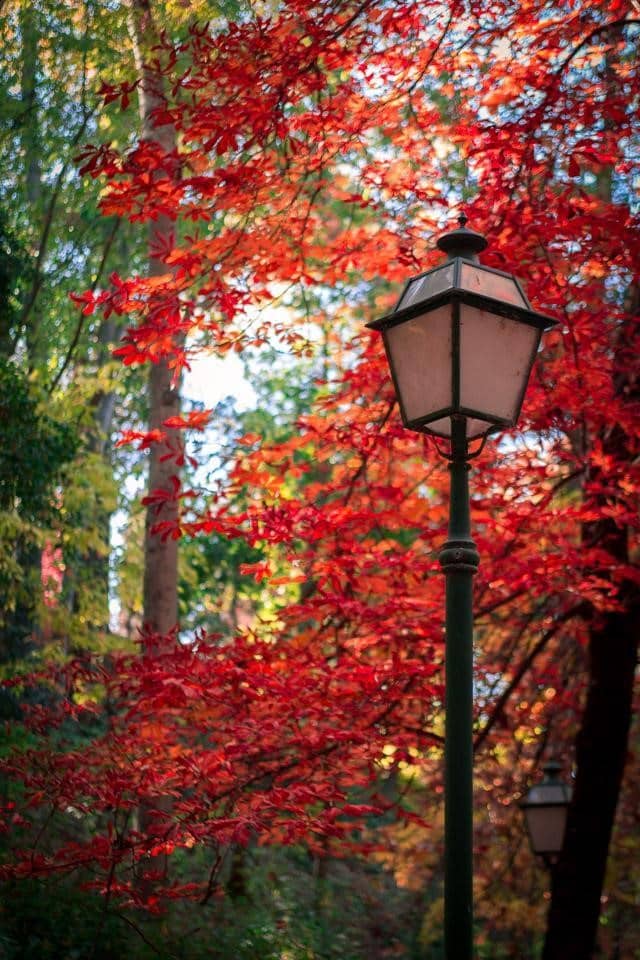
The Hue panel allows you to alter each individual color and shift its color tone toward a different one. I often use this tool to slightly adjust the color of the grass to make it look greener or yellower. It’s also a great tool to adjust the color of the leaves on trees to entirely change the mood (and season!).
This photo below was taken in early fall and it didn’t really capture the colors of the season.
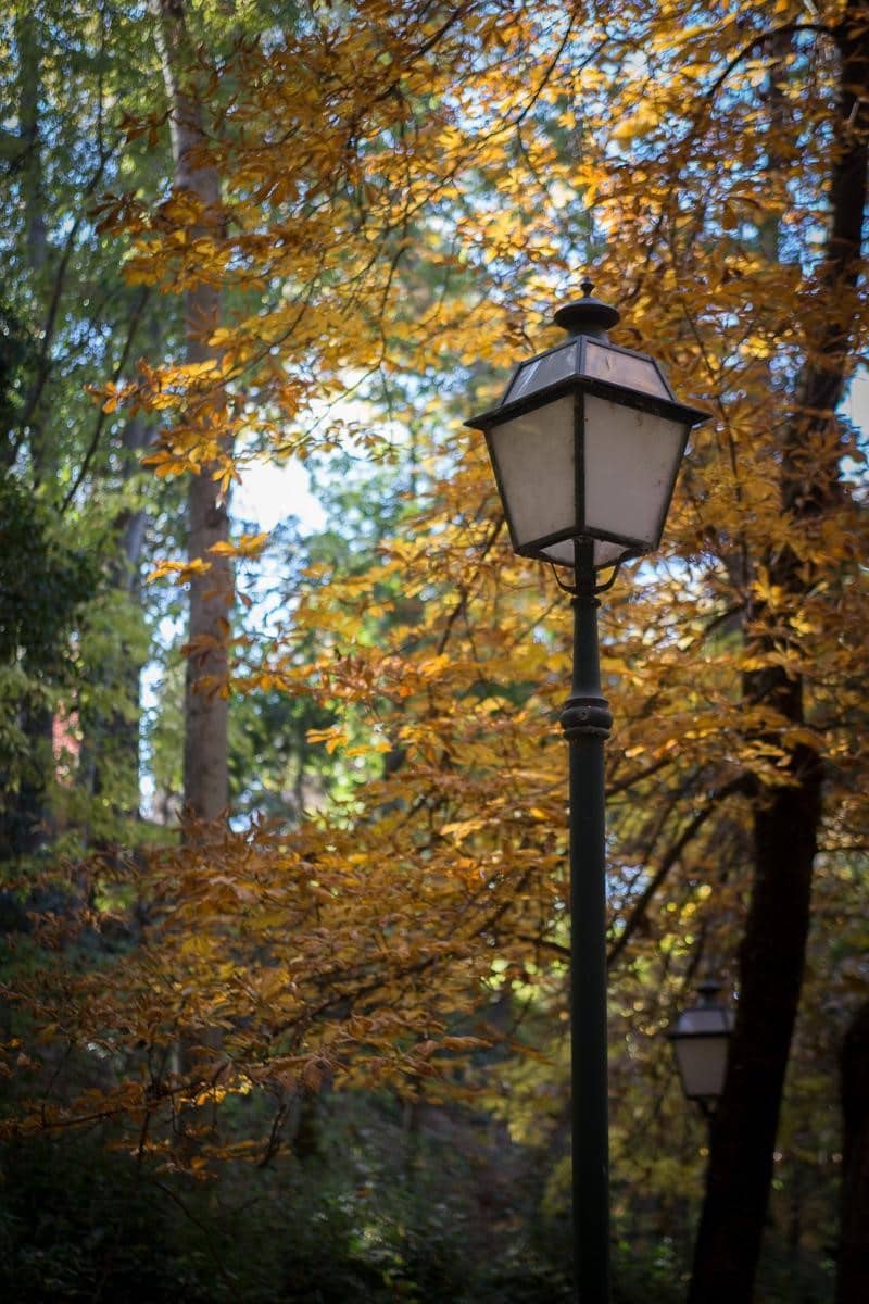
Since we don’t get beautiful, brightly colored leaves in the south of Spain, I used some Lightroom trickery and adjusted the orange and yellow hue sliders to turn the dull looking leaves into a more vibrant and fitting red color.
Saturation Panel:
Just like the saturation slider in the global adjustments panel, this section controls the intensity of the colors in the image, but allows you to adjust them individually. When some colors appear muted or too vibrant, the individual sliders can help adjust them to balance the entire image.
In this example from Morocco, the sky in the Sahara desert was hazy and looked quite dull compared to the vibrant golden sand of the dune.
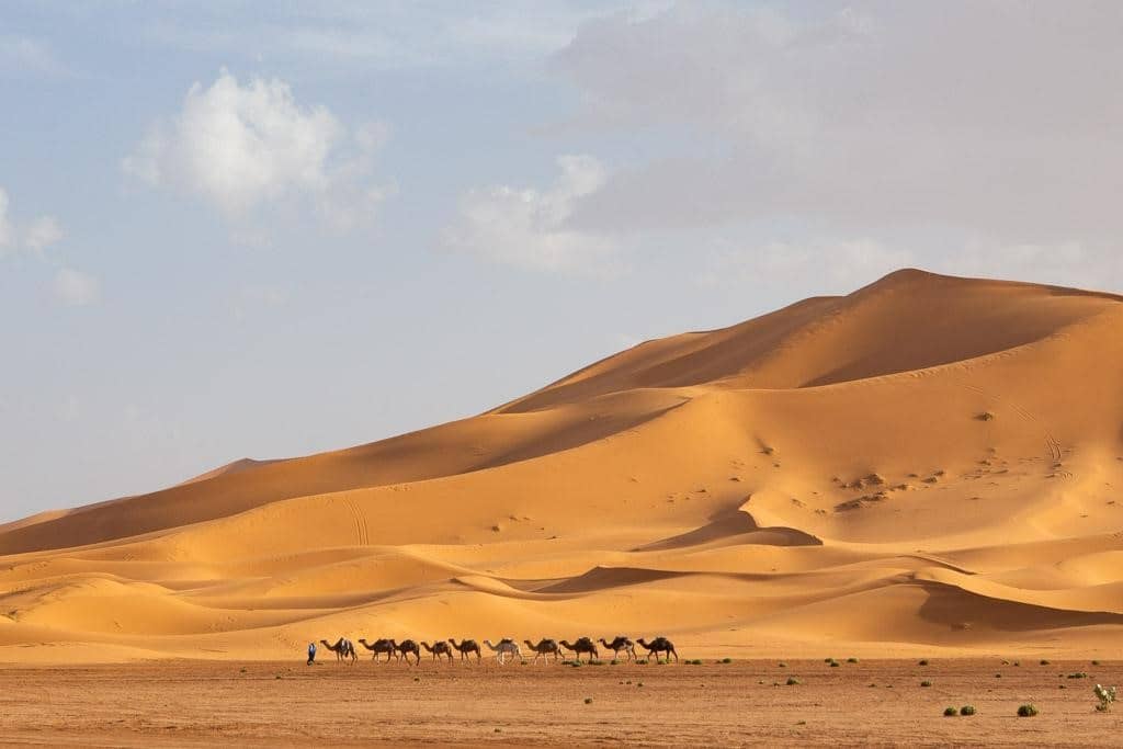
If I use the normal Saturation slider in the Basic panel, it will improve the sky a little bit, but it will also saturate the color of the sand. We can all agree this doesn’t exactly look natural.

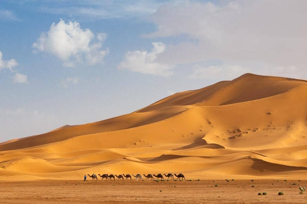
Instead, I can just adjust the blue slider in the HSL’s saturation panel to improve my sky, and leave the rest of the image untouched. The result is a much better and more natural looking image.
Luminance Slider:
Unlike saturation, luminance controls the brightness of a color, as opposed to its intensity. This slider can be very handy when dealing with colors that appear pale or washed out.
In this image, the grass surrounding the elephant looks washed out and needs some adjustment.
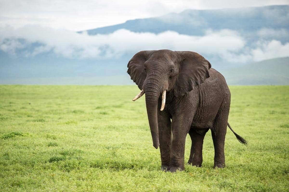
If I tone down the exposure, it would make the grass darker, but I would also lose details on the elephant. Instead, by using the green luminance slider only, I can darken the grass to give it a deeper and more appealing color.
Taking the time to learn Lightroom’s tools will really help you add a professional polish to your stock and fine art photos. So don’t be afraid to experiment with the HSL panel and see how you can improve the colors in your images!